');background-repeat:no-repeat;background-position:center;background-size:25px}.widget .widget-title{margin-top:0;margin-bottom:20px;font-size:1.1112em;font-family:var(--primary-font);letter-spacing:1px;line-height:1.5}.widget ul{margin:0;padding:0;list-style:none}.widget ul li{display:block;margin-bottom:15px;font-size:1em}.widget ul li a{text-decoration:none;color:var(--black-color)}.home section[class*=-section]{margin-top:80px;margin-bottom:80px}section[class*=-section] .widget{margin-bottom:40px}section[class*=-section] .widget:last-child{margin-bottom:0}.page-header{margin-bottom:40px}.page-header .page-title{margin-top:0;margin-bottom:65px;font-size:2em;font-weight:400;line-height:1.5}.back-to-top{background:var(--white-color);border:1px solid var(--primary-color);position:fixed;bottom:10%;right:5px;padding:0;width:45px;min-height:auto;height:45px;color:var(--primary-color);z-index:999;opacity:0;visibility:hidden}.back-to-top svg{width:25px;height:25px;display:inline-block;font-size:25px}#primary,#secondary{margin-top:60px;margin-bottom:60px}.home #primary,.home #secondary{margin-top:0;margin-bottom:0}.rightsidebar #primary{float:left;width:calc(100% - 350px);padding-right:100px}.rightsidebar #secondary{float:right;width:350px}.header-top{background:rgba(var(--primary-color-rgb),.1)}.header-top .container{display:flex;flex-wrap:wrap;align-items:center}.header-top .secondary-menu{flex:1}.site-branding:not(.has-image-text) .site-title-wrap{text-align:center}.site-title{margin:0;font-family:var(--secondary-font);color:var(--heading-color);font-weight:400;font-size:1.67em;line-height:1.3}.site-title a{text-decoration:none;color:var(--heading-color)}.site-description{margin:0;font-size:.78em;line-height:1.5;color:rgba(var(--black-color-rgb),.5)}.main-navigation ul{margin:0;padding:0;list-style:none}.main-navigation .nav-menu{display:flex;flex-wrap:wrap}.main-navigation ul li{position:relative;font-family:var(--secondary-font);font-size:.8888em;letter-spacing:.5px;display:inline-block;line-height:1.3}.main-navigation ul li a{display:inline-block;color:var(--font-color);padding:15px 30px;text-decoration:none}.header-search .search-toggle{background:0 0;border:none;padding:5px 10px;line-height:1.3;min-height:auto;color:var(--font-color)}.header-search .search-toggle svg{width:23px;height:23px;position:relative;top:2px}.header-search .search-toggle svg circle+circle,.header-search .search-toggle svg path{stroke:var(--font-color)}.header-search .header-search-wrap{position:fixed;top:0;left:0;right:0;bottom:0;background:rgba(var(--black-color-rgb),.8);z-index:9999;display:none}.header-search .header-search-inner{display:flex;flex-direction:column;justify-content:center;align-items:center;width:100%;height:100%}.header-search .header-search-wrap .search-form{max-width:640px;width:100%;background:rgba(var(--white-color-rgb),.75);height:70px}.header-search .header-search-wrap .search-form label{width:calc(100% - 70px)}.header-search .header-search-wrap .search-form .search-field{height:70px;font-size:1.3333em;padding-left:20px;padding-right:20px;font-family:var(--secondary-font)}.header-search .header-search-wrap .search-form .search-submit{width:70px;height:70px}.header-search .header-search-wrap .close{position:absolute;top:20px;right:20px;width:40px;height:50px;padding:0;background:0 0;border:none;min-height:auto;font-size:0}.header-search .header-search-wrap .close:before,.header-search .header-search-wrap .close:after{content:"";background:var(--white-color);width:30px;height:2px;position:absolute;top:0;right:0;bottom:0;left:0;margin:auto;-webkit-transform:rotate(45deg);-moz-transform:rotate(45deg);transform:rotate(45deg)}.header-search .header-search-wrap .close:after{-webkit-transform:rotate(-45deg);-moz-transform:rotate(-45deg);transform:rotate(-45deg)}.site-header.style-one .header-main .site-branding{display:flex;flex-flow:column wrap;justify-content:center;align-items:center;text-align:center;padding:30px 0;border-bottom:1px solid rgba(var(--primary-color-rgb),.1)}.site-header.style-one .header-bottom{padding-top:20px;padding-bottom:20px}.site-header.style-one .header-bottom .container{display:flex;flex-wrap:wrap;align-items:center}.site-header.style-one .header-bottom .main-navigation{flex:1}.site-header.style-one .header-bottom .header-right{display:flex;flex-wrap:wrap;align-items:center}.site-header.style-one .header-bottom .main-navigation .nav-menu>li:first-child>a{padding-left:0}.site-banner{margin-bottom:80px}.banner-slider .item{position:relative}.banner-slider .item .banner-caption{position:absolute;top:0;left:0;width:100%;height:100%;background:rgba(var(--heading-color-rgb),.9);display:flex;flex-direction:column;justify-content:center;align-items:center}.banner-slider .item .banner-caption .item-title{margin-top:20px;margin-bottom:0;font-size:1.67em;font-weight:400;line-height:1.3}.banner-slider .item .banner-caption .item-title a{display:inline-block;color:var(--white-color)}.banner-slider .item .banner-caption .item-meta{margin-top:15px;margin-left:-10px;margin-right:-10px}.banner-slider .item .banner-caption .item-meta>span{display:inline-block;margin-left:10px;margin-right:10px;color:var(--white-color);font-family:var(--secondary-font);font-size:.7778em;letter-spacing:.5px;line-height:1.3;margin-top:10px}.banner-slider .item .banner-caption .item-meta>span svg{vertical-align:middle}.site-main article .post-thumbnail{margin:0;padding-bottom:20px;position:relative}.site-main article .post-thumbnail .post-pinit-button{position:absolute;top:10px;left:10px;background:0 0;border:none;padding:0;min-height:auto}.blog .content-area .page-header .page-title{margin-bottom:0}.widget-area .widget{margin-top:40px;border-top:1px solid rgba(var(--primary-color-rgb),.1);margin-bottom:0;padding-top:40px}.widget-area .widget:first-child{margin-top:0}.widget-area .widget .widget-title{font-size:.8888em;font-family:var(--secondary-font);font-weight:600;font-style:italic}#secondary .widget:last-child{margin-bottom:0}.widget .widget-title{font-size:1.11em;font-family:var(--secondary-font);font-weight:400;letter-spacing:0;margin-bottom:30px}.widget-area .widget ul li{font-size:.8888em;line-height:1.5;letter-spacing:.2px}.widget_text .textwidget{font-size:1em;letter-spacing:.2px}.widget_text .textwidget p{margin-top:20px;margin-bottom:0}.widget_text .textwidget p:first-child{margin-top:0}.dr-most-popular-rcp .dr-mst-pop-details .dr-mst-pop-title{font-size:1em;line-height:1.5;margin-bottom:10px}.widget ul li.dr-mst-pop-wrap{display:flex}.widget-area .widget[class*=widget_delicious_] ul li{font-size:1em}@media screen and (max-width:1270px){.container{max-width:1170px}}@media screen and (max-width:1199px){.container{max-width:1000px}.rightsidebar #primary{width:calc(100% - 320px);padding-right:60px}.rightsidebar #secondary{width:320px}}@media screen and (min-width:1025px){.main-navigation>div{display:block!important}.main-navigation .toggle-btn,.mobile-header{display:none}}@media screen and (max-width:1024px){.container{max-width:768px;padding:0 15px}.rightsidebar #primary{float:none;width:100%;padding-right:0}.rightsidebar #secondary{float:none;width:100%}.mobile-header{padding:15px 0;border-bottom:1px solid rgba(var(--primary-color-rgb),.1)}.mobile-header .container{display:flex;flex-wrap:wrap;align-items:center}.mobile-header .site-branding{padding-right:10px;flex:1;display:flex;flex-wrap:wrap;align-items:center}.mobile-header .site-branding:not(.has-image-text) .site-title-wrap{text-align:left}.mobile-header .site-branding .site-logo+.site-title-wrap{padding-left:10px}.mobile-header .site-branding .site-title{font-size:1.33em}.mbl-header-right{display:flex;flex-wrap:wrap;align-items:center;position:relative}.mobile-header .toggle-btn{padding:0;border:none;width:35px;height:35px;min-height:auto;background:0 0;position:relative;color:inherit}.mobile-header .toggle-btn .toggle-bar{background:var(--font-color);width:20px;height:2px;position:absolute;top:0;left:0;right:0;bottom:0;margin:auto}.mobile-header .toggle-btn .toggle-bar:first-child{top:-12px}.mobile-header .toggle-btn .toggle-bar:last-child{bottom:-12px}.primary-menu-list{order:-1}.primary-menu-list .close{position:relative;top:-2px;width:35px;height:35px;min-height:auto;background:0 0;border:none;color:inherit;display:none}.primary-menu-list .close:before,.primary-menu-list .close:after{content:"";background:rgba(var(--black-color-rgb),.7);width:20px;height:2px;position:absolute;top:0;right:0;bottom:0;left:0;margin:auto;-webkit-transform:rotate(45deg);-moz-transform:rotate(45deg);transform:rotate(45deg)}.primary-menu-list .close:after{-webkit-transform:rotate(-45deg);-moz-transform:rotate(-45deg);transform:rotate(-45deg)}.mobile-header-popup{position:fixed;top:0;left:0;width:100%;bottom:0;background:var(--white-color);z-index:9999;display:none}.mobile-header-popup .mbl-header-inner{padding-top:40px;background:rgba(var(--primary-color-rgb),.3);height:100%;overflow-x:hidden;overflow-y:auto}.mbl-header-mid{padding-bottom:20px;display:flex;flex-wrap:wrap}.mobile-header .main-navigation,.mobile-header .secondary-menu{flex:1}.mobile-header .main-navigation+.secondary-menu{border-left:1px solid rgba(var(--primary-color-rgb),.2)}.mobile-header .main-navigation .toggle-btn{display:none}.mobile-header .main-navigation .nav-menu{display:block}.mobile-header .main-navigation ul li{display:block}.mobile-header .main-navigation ul li a{padding:5px 10px;margin:10px;display:inline-block}.mobile-header .header-search .search-toggle{padding-right:0}.mobile-header .header-search .search-toggle svg{width:20px;height:20px}.mbl-header-bottom{padding-bottom:20px}.mobile-header+.site-header{display:none}}@media screen and (max-width:767px){.container{max-width:420px}.page-header .page-title{font-size:1.67em}.banner-slider .item .banner-caption{position:static;width:auto;height:auto}.site-main article .post-thumbnail img{width:100%;height:100%;object-fit:cover}.site-main article{flex-direction:column}.site-main article .post-thumbnail{width:100%;margin-bottom:20px}}:root{--primary-font:'DM Sans',sans-serif;--secondary-font:'Domine',serif;--dr-primary-font:'DM Sans',sans-serif;--dr-secondary-font:'Domine',serif;--font-color:#232323;--font-color-rgb:35,35,35;--primary-color:#b05045;--primary-color-rgb:176,80,69;--secondary-color:#646f58;--secondary-color-rgb:100,111,88;--black-color:#000;--black-color-rgb:0,0,0;--white-color:#fff;--white-color-rgb:255,255,255}.banner-slider.style-two .item-wrapper{padding-left:30px;padding-right:30px}.banner-slider.style-two .item .banner-caption{position:relative;background:0 0;text-align:center;height:auto;display:block;padding-top:30px}.banner-slider.style-two .item .banner-caption .item-title{font-size:1.33em;line-height:1.46}.banner-slider.style-two .item .banner-caption .item-title a{color:var(--heading-color)}.banner-slider.style-two .item .banner-caption .item-meta{margin-top:5px}.banner-slider.style-two .item .banner-caption .item-meta>span{color:var(--heading-color)}.grid-with-first-lg .site-main{display:flex;flex-wrap:wrap;margin-left:-3%;margin-right:-3%}.grid-with-first-lg .site-main article{display:block;padding-left:3%;padding-right:3%;width:50%;margin-top:50px;padding-top:50px;border-top:1px solid rgba(var(--primary-color-rgb),.15)}.grid-with-first-lg .site-main article:first-child{width:100%;margin-top:0;padding-top:0;border-top:none}.grid-with-first-lg .site-main .post-thumbnail{width:100%;margin-bottom:25px}@media screen and (max-width:767px){.grid-with-first-lg .site-main article{width:100%;padding-left:0;padding-right:0}}.banner-slider.style-two .item .banner-caption .item-meta>span svg.icon{width:15px;height:15px;margin-right:5px;vertical-align:-3px;fill:#e84e3b;-webkit-filter:drop-shadow(0 3px 6px rgba(232,78,59,.26));filter:drop-shadow(0 3px 6px rgba(232,78,59,.26));display:inline-block}.banner-slider.style-two .item .banner-caption .item-meta>span svg.icon+span{vertical-align:middle}.widget .widget-title{font-size:2.22em}.site-title,.site-description{position:absolute;clip:rect(1px,1px,1px,1px)}.header-top{display:none}.site-header.style-one .header-bottom{background:#fbeae8}section#about_section{background:#fbeae8}.home section[class*=-section]{padding:50px;margin-top:50px;margin-bottom:50px}:root{-webkit-touch-callout:none}
Alsatian-Cuisine.com | Authentic Alsatian Recipes & Culinary Traditions
Skip to content (Press Enter)
1 hr 50 mins
Intermediate
3 hrs 55 mins
Intermediate
2 hrs 5 mins
Intermediate
Traditional or refined, Alsatian cuisine will delight our taste buds. Charcuterie as well as pastry, Alsace is considered one of the most french gourmet provinces .
Alsatian gastronomy, strongly imbued with Germanic culinary traditions, is rich in local specialties with its winegrower’s pie, its famous sauerkraut, its stew, its ham on the bone or its baeckeofe. The friendly winstubs or farm inns welcome you to finish on a sweet note with its famous plum cake or its kugelhof.
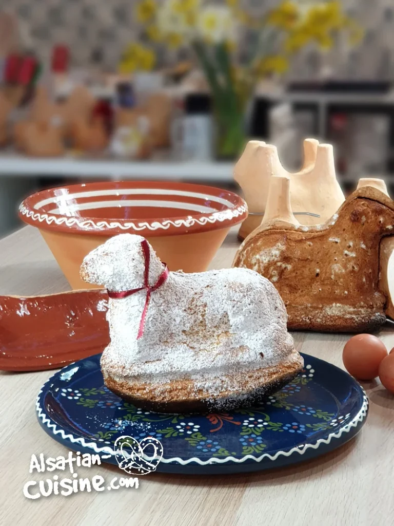
“Lamala” is a traditional Easter dish in the Alsace region of France, and it has a special cultural and religious significance. It’s also known as “Osterlammele” in Alsatian and is often made in the shape …
Discover the secrets of perfect Tarte Flambée! Explore our authentic Alsatian recipe and delve into the tradition of this delicious dish.
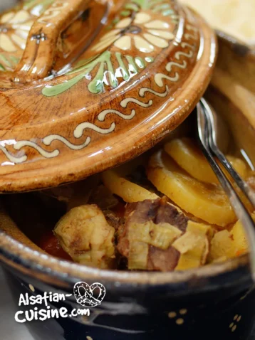
Baeckeoffe is a traditional Alsatian dish from the northeastern region of France. The name translates to “baker’s oven” in the Alsatian dialect. This hearty casserole is typically made with marinated mutton, beef, and pork, which …
Choucroute, also known as “choucroute garnie,” is a traditional dish from the Alsace region of France, and its name literally translates to “dressed sauerkraut” in French. The dish is essentially a hearty combination of fermented …
Kugelhopf (also spelled as Gugelhupf, Kouglof, Kougelhopf, and in various other ways) is a traditional yeast-based cake that’s well-known in regions such as Alsace in France, Germany, Austria, and other parts of Central Europe. The …